Friday, November 30, 2018
Rodger Richardson " let me sow love" - Niko Fernandez
Rodger Richardson
1) Technical decisions and why I'm compelled/moved by said tech decisions?
I like that he is choosing to be close and make the compositions to be tight as well as the the lack of use of color. I think that those two things help further and tell the emotions that are told by the subjects faces. I think its very important that he's photographing people also seem to be about their own business and shows that he's been approaching strangers for these Photographs and that adds another layer to this series. I really enjoy the concept of meeting strangers and having them open up to me and be willing to be photographed
2) What I believe the artist's intentions and concept are?
Richardson is trying to talk about the racial divide in the country and he had explained that he normally shoots in color. I think he chose to photograph this in b&w to be able to add to the intensity to his subject matter. Recently since our new election I feel like there was a huge rise in how we all segregated ourselves and Richardson feels like we have been moving backwards from the progress we have made in the past.
3) How do I personally respond to the intentions and concepts?
I think its important that he is pointing out this issue. In the United States there has always been a issue with equal rights and as a society i felt like we had made a lot of progress. I moved here with my family because of that progress and since the 2016 presidential election its seemingly just been a constant removal of the progress we have made. I think this series is important because I feel like this is an issue people are trying to currently ignore. People feel as if things are final and equal for both parties when in reality we are all starting to separate each other again and reverting back to old tendencies.
4) Why I chose this artist?
I chose this because of the style of portraits that were taken that were similar to the project that i'm currently working on.
there is a sense of authenticity that comes out of peoples faces. Peoples faces and gestures tell massive amounts of how their feeling and I think this was an important part of this project. The lack of color from what the artist usually works in also shows that he thinks this important and out of his body of work he wants this project to stand out. I really love that he cares about whats going on around him and that resonates within me simply because I care massively about the people who are around me and as an immigrant I would love to see this self segregation come to and end.
Eugene Richards "The Run of Times" - Denver Edmonds
1) Technical decision and why I'm compelled/moved by said tech decisions?
I enjoying the positioning of each subject. This element allows viewers to focus on light and contrast in the photo. However, there is no dramatic lighting within these photographs, which I appreciate because I feel as though it would take away from the subjects and the movement. The choice of black and white is interesting because it allows viewers to focus on the subjects and the stories presented without being distracted by color.
2) What I believe the artist's intentions and concept are?
I feel as though Richards wanted to capture clear stories within these photos. Without using color, the artist really had to focus on light, environment, and subjects. Each photograph depicts relatable emotions and events that could occur to anyone. I feel as though these photographs are an appreciate for life because of its spontaneousness.
I feel as though Richards wanted to capture clear stories within these photos. Without using color, the artist really had to focus on light, environment, and subjects. Each photograph depicts relatable emotions and events that could occur to anyone. I feel as though these photographs are an appreciate for life because of its spontaneousness.
3) How do I personally respond to the intentions and concepts?
I enjoy how Richards compensates for the lack of color by providing intriguing elements. The tension shown by the positioning and emotion of the subjects keeps me interested to know more. The little boy playing with the white mask allows me to wonder about race and nativity. The positioning in the middle photo is captured so well. The bride has a very calm face while being surrounded by laughing boys. The low light on the bride and laughing boy puts both subjects in the story. The angles of the water in the bottom picture create these mystical shapes around the subjects.
I enjoy how Richards compensates for the lack of color by providing intriguing elements. The tension shown by the positioning and emotion of the subjects keeps me interested to know more. The little boy playing with the white mask allows me to wonder about race and nativity. The positioning in the middle photo is captured so well. The bride has a very calm face while being surrounded by laughing boys. The low light on the bride and laughing boy puts both subjects in the story. The angles of the water in the bottom picture create these mystical shapes around the subjects.
4) Why I chose this artist?
I chose this artist because I am intrigued by the idea of not focusing on formal elements as much as the story told within the photos. Formal elements are important, but I feel as though Richards managed to focus on more subjects, positioning, and movement rather than light, color, and environment. This intrigues me because there are many people with definitions of what photography is and this usually is followed by rules and perceptions. However, I enjoy artists that don't necessarily follow rules and just allow their pictures to be.
I chose this artist because I am intrigued by the idea of not focusing on formal elements as much as the story told within the photos. Formal elements are important, but I feel as though Richards managed to focus on more subjects, positioning, and movement rather than light, color, and environment. This intrigues me because there are many people with definitions of what photography is and this usually is followed by rules and perceptions. However, I enjoy artists that don't necessarily follow rules and just allow their pictures to be.
Thursday, November 29, 2018
Hana Pearlman, CHELSEA DARTER
1) These images are so rich in color that it immediatly drew me in. I love the simplicity of each image, it makes for an even stronger composition, there isnt so much to take your attention away from the calmness of the image.
2) I believe the artist intentions were to show images that were from a place she knew, but also seemed a little haunting. The top image of the carcases, completely bare, really is a freaky sight to see. The touch of red against the white background is what really makes the bones stick out. The fruit, pomegrante maybe, looks like blood highlighted against the white of the cutting board. and the white trees sticking out from the bright bue water really is a nice contrast. .
3) I personally am really drawn to the haunting white and bright colors of the images, which is why I chose these three. There were more that also were equally as daunting to these.
Brezaja Hutcheson - Susan Worsham - Post 13
1. Which of the artist's many technical choices are of interest to you and why?
I admire the way Worsham considers all of the elements that are in the frame before she makes her pictures. The position of her subjects, color, spacial elements, and location are all aspects that she thinks about through a critical and conceptual lens; it is evident in all of her photos. Worsham blends a mixture of landscape and portrait photography, which creates an interesting hybrid that also allows room for discussion surrounding the subject matter in her photography.
Worsham ventures through different worlds in a way, examining neighborhoods of all classes, the environments that they live in, as well as the relationships between her subjects and others, as well as her subjects in nature. Looking at her work is refreshing to me, due to the vibrant colors, varying subjects in her portraits, as well as the constant change of scenery.
2. What do you believe are the artist's conceptual work and/or thematic intentions?
Worsham's intentions are to capture ways of life that she was not privy to previously, due to forces outside of her control. She wants to examine these humble beginnings in these communities, through a lens that is not exploitative in any way, but through one that is looking to bridge the gap between the new world she is observing and the one she has known all her life. This is especially evident in her series "By the Grace of God". Focusing on communities and neighborhoods that are usually overlooked, she spends time with her subjects, getting to know their stories, and then making pictures of them and in their homes. By allowing her viewers to also view snippets of these intimate moments she has shared with strangers, it also opens discussion for the concept of memory, family dynamics, as well as the relationship between self and others.
3. How do you personally respond to these choices and intents?
All of her photos are nothing short of inspiring. It reminds me that in my own portraiture practice, it is necessary to create an open dialogue and relationship between myself and my subjects. I believe that this is the most vital piece that could completely transform the way my pictures that I make on my own turn out, as well as the potency that they possess. I am also inspired to travel to places that are unmarked or overlooked, the same way that Worsham did in her "By the Grace of God" series. I am inspired to think more critically about the composition of my own photos; what I choose to include in my photos, and the messages that these objects or placement of my subjects are conveying.
Ruben Pagan - Jack Spencer - This Land
In "This Land" by Jack Spencer, there are many technical aspects that work together which create a sense of nostalgia regarding American History. Although some of the edits on photos may be over-the-top when seen individually, it works well throughout the series due to it being a clear intention by the fact that it is continuously repeated. The edits consist of "old-timey" photography looks upon seeing washed out colors, black and white, sepia tones, distressed images, and historical subject matter. The way in which the images are composed shows that the photographer is directly pointing at these vintage things to be the main subjects in the series. The settings and subjects were chosen well to portray this feeling even though the images don't point to one specific time, but a range of varying American History.
Jack Spencer's concepts are pretty clear here, to show the old versions of our country, which we all thought were long gone. These images were shot relatively recently by Spencer. He wanted to create a nostalgic view of historical America and he did that quite successfully. He worked on this series for 13 years since 2003, drove through 48 states, driving 80,000 miles. Spencer knew it was important to capture many different cultural aspects and environments from varying epochs.
The intentions and concepts of this series are incredibly stunning to my gaze. I have never seen a series like this that has so many images that all maintained the capability and concept of the history that is shown. It was well worth his 13 years of shooting, traveling, and editing to make these photographs. When someone takes an idea and pushes it to the next level that no one has really done before, really makes you, and your work stand-out in the world of art.
Wednesday, November 28, 2018
Mariela Gavino - Christophe Jacrot - Post 13
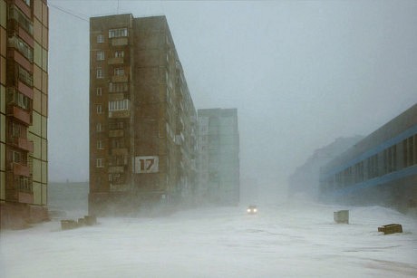
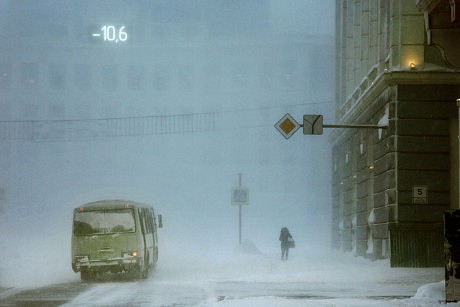
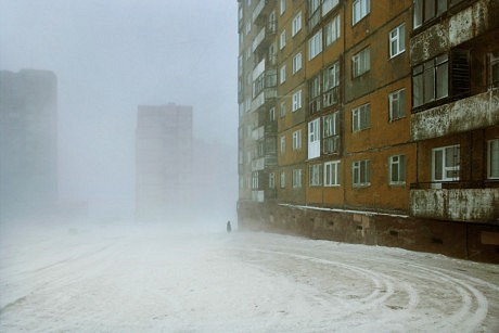
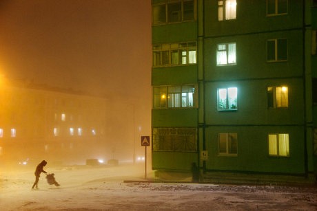
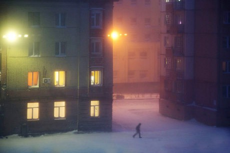
I was interested in Jacrots composition as well as his use of wide angle. He captures a full composition, yet there is still so much space in them. The white snow creates the illusion of emptiness and space. He utilizes the whiteness to his full advantage by including the haziness of the falling snow as well. Jacrot also has a very strong consideration on how he composes people or cars in his pictures. He makes them look small compared to the towering buildings which further emphasizes the space and solidarity. It almost looks like a post apocalyptic landscape.
Thematically, I think Jacrot is making photos of the isolation that comes along with winter. When it is literally impossible to walk outside in these conditions, the scenes of people trying to tread along makes them look like the only person in the world. Its harsh but it looks stunning. It could be out of a movie. The surrealistic aspect of these landscapes is something I feel that Jacrot is also trying to push.
I personally found his pictures haunting. There's something very eerie about being alone out in the snow and how quiet it is. The sky blends into the ground at some point. I think he captured this creepiness and loneliness perfectly. I was amazed at how he captured the pedestrians and cars in these very precise moments. He must've waited hours.
Sunday, November 25, 2018
Uma Kinoshita - Nicole Plummer Post 11
One of Uma’s most
interesting medium choices was her use of paper. Her images were printed
on Japanese traditional hand-screened paper called “Kamikawasaki-washi” from Nihonmatsu,
Fukushima Prefecture. Because of this
intentional choice, these images have a strong connection to the region they
depict. This allows viewers who
understand the depth of this paper to immediately understand Uma’s intentions. In addition, the choice of black and white
images, I believe, is essential to completing the emotion Uma is striving for.
Since
Uma’s photos had been taken within evacuation zones, I felt the solemn mood
right away. The blurred and scratchy
images, gave them a forgotten and abandoned emotion. These feelings can easily be found in nuclear
situations from all of the death and destruction that surrounds. Through trial
and careful consideration of method and material, deeper emotions are visibly
present in all of this series.
Although
I have never experienced any of the topics Uma is touching on, I feel the
solemn nature she is addressing. She has
created a porthole of sorts allowing one to travel to these moments, which
greatly impacted her. Photographing a
memory lost is not any easy task, but her attempt and effort has greatly paid
off, and allows for an experience very few could portray.
Subscribe to:
Comments (Atom)


