Thursday, September 20, 2018

Mariela Gavino - Naomi Harris - Post 4


Naomi Harris

One of the most notable characteristics in Naomi Harris' photos is her use of flash and saturation in the Haddon Hall series. All her subjects are well-lit and some photos are even intentionally over exposed. They also have high contrast, often making the photo seem graphic like. Harris successfully executes these popularly undesirable qualities and makes beautifully colorful and exaggerated photos.

They way Harris composes her subjects, the old folks, gives them a new sense of youth. Each photo shows the subjects wearing or doing something that is usually associated with young people. The bright colors and tanned skin make the subjects appear almost fake and over emphasizes their aged features. She's giving them the same effort that is usually put into photographing young models in similar tropical settings. You can almost feel the hotness and even their skin through the photos. She is displaying these old folks living an unbothered and maybe still scandalous life.

I was attracted to the colors of Harris' photos. The way everything looks bright and exciting. I was also very interested in her lighting techniques as well. I don't necessarily know how she pulled it off, but the way she utilizes the sun as well as artificial light is definitely a realm I would like to experiment with as well. I found Harris' "campy" style so endearing and made me love the people in her photos.

Hana Pearlman. Post 4 PAULINE GOLA: IN THE DEEP

1)  Although it may seem that Pauline Gola used double exposures, photoshop, and visual distortion in her beautiful underwater photographs, that would all be a ruse. The images are all without the great use of photoshop. The images are all composed within camera  All photographs are shot underwater, giving the images a womb-like energy to them. I believe the choice to put the images in black and white was a conscious and accurate choice. Some of the images use blur or double exposure, changing the energy to feel agitated, and in some instances a sense of panic. 

2)  There were few tidbits of the information below the images and about the artist. Paule Gola chose to make photographs that showed her experience with being a swimmer her entire life. Feeling at home in the water and out of place on land, she expressed this feeling very accurately in the exhibition of her work. Gola wanted to show her personal language and experience with having a childhood within the water. Which I think comes across in a somewhat strong manor, some images giving just the hint of childlike wonderment.  

3)  On a personal level, these images attracted me, not because  I relate to them in any fashion, but because I found them incredibly interesting. The second and third images leave me simply speechless. The curtain and the window leading to the darker depths of the water is astonishing to me. Every photo I have ever seen is always something played off another artist, so on and so forth, as art usually is. However, I haven't seen images quite like this and that's what attracted me. 


Ryan McGinley - Abby Chambers - Post 4


1) Which of the artist’s many technical choices are of interest to you and why? 

I was introduced to McGinley's work in my time studio class last semester. If I remember correctly, we were talking about motion and how a video is essentially thousands of photos put together and how photos can capture motion or something like that. When my professor shows the class some of McGinley's work, I was really drawn in by how soft and candid, but also intimate his photos are. They really feel like a single moment captured in an image.

2) What do you believe are the artist’s conceptual and/or thematic intentions?  

McGinley enjoys trying to capture motion in his photographs. I know he also likes to create the illusion of chaos, so I think that's the concept/theme he's trying to achieve. I think he's trying to capture chaos and movement in a single moment. All his pictures feel very candid.

3) How do you personally respond to these choices and intents?  

I really like all of Ryan McGinley's photos. They're very raw, real, and intimate and I respect both him and the models in his photos for creating something that feels that way. 

Monday, September 17, 2018

Amber Carpenter - Chuck Grant - Post 3

1) Which of the artist’s many technical choices are of interest to you and why? 

I very much enjoy Chuck's use of harsh lighting overhead of their subject, yet I love how they also aim to achieve a more dreamy look, when they're not dabbling in highly contrasted images. I think lighting is key when it comes to Chuck's photography, a good majority of it wouldn't look the same if it wasn't for the key use of lighting. I also think the use of color in her photographs give it a sort of old life to them.
2) What do you believe are the artist’s conceptual and/or thematic intentions?  


I think her choices conceptually have changed over the years from very poetic portraits on 120mm film, to more commercialized choices but never the less I still think her dreamy and raw portraits are a big theme. I think she chose to have dramatic lighting and very real looking portraits in her early work to where now she is going a more dreamy soft type of portrait. 


3) How do you personally respond to these choices and intents? 


As I do enjoy her softer looking photographs I do prefer her 120mm Hasellblad portraits. I think her style is shifting with the current trends in photography and probably in her own way moving on to a more mature state of her photography.


Chuck Grant


Sunday, September 16, 2018

Amber Carpenter - Luke Gilford - Post 2

1) Which of the artist’s many technical choices are of interest to you and why? 

When Luke composes his shots I feel as if there is such a clean and perfect ness and attention to detail of every part of the image. What interests me the most though is his color use and and almost perfect crispness of every shot he makes. I also love that he uses film for almost all of his work. As I see it gaining traction back into the actual industry once again its nice to see some clean portra shots that aren't trying to be so lossed of creativity and gaining the clean shots we see before us.
2) What do you believe are the artist’s conceptual and/or thematic intentions?  

I think Luke Gilford tries to achieve clean and crisp portraits while also still keep the creative melancholy and blank stares that many of them contain. I think he creates a very mute atmosphere with the pictures he makes, the models are rarely ever expressive or showing emotion and I think that is a artistic intent. I think with certainty he has a general theme / aesthetics going on in his pictures that are very clear when you look at them. 

3) How do you personally respond to these choices and intents?  

I find the simplicity of his pictures to be boring yet very intriguing at the same time, I think he pulls together concepts that would otherwise not be very visually interesting but with the way he creates them he makes it work.
I really enjoy looking at Luke's photos and I would like to see more chaotic shots from him.

Luke Gilford


Saturday, September 15, 2018

Marlena Artis - Todd Antony post 4


1) Which of the artist's technical choices are of interest to you and why?

What caught my attention first was the cool toned filter that created an eerie magical feel to this series, "Dekotora". Antony lets the main source of light be the truck itself in order to not distract the viewer. He shoots each Dekotora truck driver in the same position from the inside and outside. Also, the stranded environment really contributes to creating a ghostly mood. Personally, because of the way Antony decided to shoot this series I feel extremely drawn to each truck. I really appreciate how this series was shot because it tells a story for each truck driver. Inside each driver's truck, it clearly shows who the driver is and how he chose to decorate the interior. Antony places each driver in front of their lit up Dekotora truck, as if gazing at their hard work with pride and honor. 

2) What do you believe are the artist's conceptual and/or thematic intentions?

I believe Antony's intentions were to share the evolution of these extremely rare Dekotora trucks and their drivers. There are only an estimated six hundred Dekotora drivers left in the world. Dekotora culture began in the early 1970's because of Torakku Yaro, a popular film series. Drivers would decorate their trucks in hopes of becoming famous like the actors in Torakku Yaro, but eventually grew to hold significant spiritual meaning. After the tsunami in 2011, these drivers would make trips to Northern Japan to help and raise their people's spirits. These drivers intended to bring hope during these dark times with their lit up trucks, being Antony's reason for shooting this series the way that he did. I believe Antony wanted to express a lonely or empty feeling, shooting in a stranded area with a cool eerie filter. But the only lights being inside and on their trucks to represent a sliver of hope in this darkness. The truck drivers look at their hard work from a distance, full of pride. 

3) How do you personally respond to these choices and intents?

I really enjoy Antony's intents on preserving the culture and stories behind these Dekotora drivers. His concepts and the way he presents the narrative of this series is relatively straightforward, but I'm still able to appreciate his work. Antony had to spend a lot of time with these drivers as well in order to learn about the culture and history of Dekotora drivers. These people spent thousands of dollars in order to decorate their trucks in this manner, and have such a heavy spiritual connection with their work as well. With Antony's technical decisions in his shots, I can really feel how proud each driver is of their work. I can sense how significant these lit up trucks are, as if they were a guide in these dark empty streets. 


Friday, September 14, 2018

Wolfgang Tillman- emma doherty

1. Which of the artists many technical choices are of interest to you and why?Being an avid fan of Tillman’s work, I have studied and reviewed his work consistently. When I first look at Wolfgang tillmans work, the first thing that comes to mind is his use of abstraction. He has a line of work that he refers to as “lighters” which include directly exposing photo sensitive paper and experimenting with different forms of fixers. Without sounding cliche, Tillman is literally looking st the photo beyond the camera (or without it).

2.What do you believe are the artists conceptual and/or thematic intentions?When I originally went to his website, the first thing I looked for was his biography. When I got to the page, instead of having a basic summary of his early life, education, and exhibitions, he has a complete timeline of of his life from birth till present day. All factual and all straight forward which I think for how abstract he is best discribes him. Although his work his abstract and consists of realism he is continuously straight forward with one personal intention in his work.


3. How do you personally respond to these intentions? 
In my opinion I think it wasn’t a skill or a mindset that he has always had. He has definitely been the type of artist to evolve and create his persona over years and years of work. Unlike some artists, Tillman didn’t start with the same artistic intentions then he has now. 

4.. Reason why I chose this artistI have always been interested in Tillmans work and I think he shows me a level of abstraction that I have yet to find in my own work. He takes simple and straight forward concepts and evolves them into abstract ideas. 


Hana Pearlman: SAMANTHA GEBALLE ON BRITTNEY CATHEY-ADAMS post 3

1)  I was drawn to the artists use of film and black and white. I felt it made the images feel more elegant, instead of shocking. 
2)  The intentions of the pieces are to show that no matter what society says, you are beautiful. They are showing that no matter what gravity says, or how hard it is to overcome different things due to your size, that big is beautiful. They wanted to express and talk about something that would hit deep enough to follow you home. 
3)  I think shooting in the forest and shooting in the nude was a very conscious and direct choice. I think a forest is a place of refuge, also showing strength, and I believe that shows in the images. The bottom image of the woman pulling the rope in the water is the most moving to me. Her face is set with determination and her body is using muscles in an almost hard ugly way, but the water around her gives off a beautiful reflection of the sun, returning the image to a soft and beautiful one. 


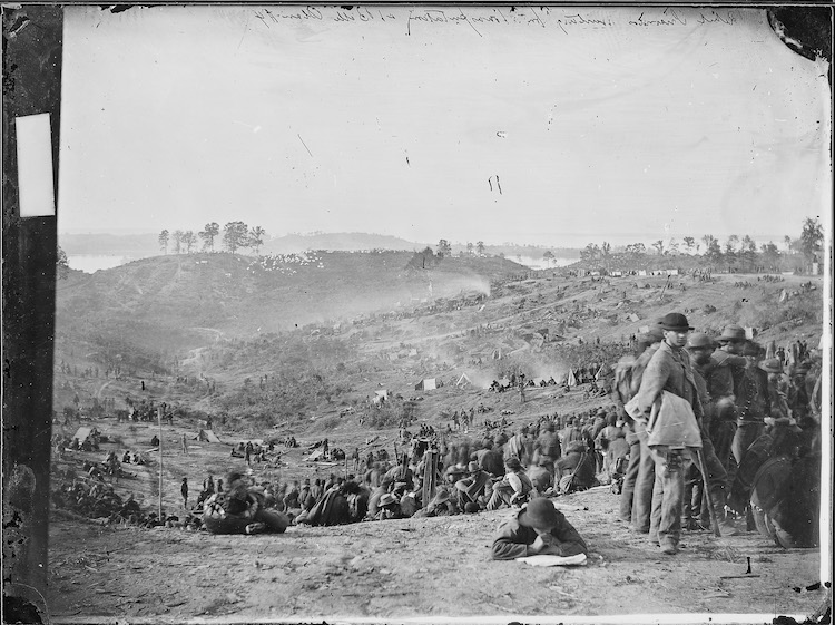
Mathew Brady-Madeline Edwards-Post 3


Mathew Brady American Civil War Photography

1) Which of the artist’s many technical choices are of interest to you and why?  

Maybe its not so much a technical choice, but I love Mathew Brady's willingness to get down and dirty in order to capture an image. He risked his life in order to document the horrors of the Civil War, almost dying at the Battle of Bull Run. I love his willingness to never shy away from the truth.
 
2) What do you believe are the artist’s conceptual and/or thematic intentions? 
I believe Mathew Brady photographed Civil War scenes to bring the reality of war to those cozy in their homes and those protected by the passage of time. Mathew Brady recognized the significance of the Civil War and documented it so that the country may never ignore or forget the suffering individuals went through in order to right the wrong of slavery. Brady's photographs are a dire warning to the country to not repeat the same mistakes. 

3) How do you personally respond to these choices and intents? 
Mathew Brady's photographs fill me with a sense of wonder. Its hard to believe such tragedy and destruction occurred on the soil we stand on. One part of my mind says such horrors couldn't have happened so relatively recently and so close to home. Brady's photographs set my mind straight. I cannot deny or shy away from uncomfortable truths with Brady's stark photographic evidence shoved in my face. 

Megan Jacobs - Abby Chambers - Post 3


Megan Jacobs

1) Which of the artist’s many technical choices are of interest to you and why?  

At first glance, what drew me into these photos was how they had an almost formal feel, but with bright colors and patterns. It kind of reminded me of Kehinde Wiley's paintings. I was also drawn in by the figures under the fabric. They made me think go ghosts or something paranormal, which I like, so that made me more interested in finding out what the artist was trying to achieve. 

2) What do you believe are the artist’s conceptual and/or thematic intentions?  

I believe the Jacobs' intention is to give tribute to how much a mother does for a child. I learned that in early photography, if a child was being photographed the mother usually sat under a sheet and had the child sit on her lap to hold them still because exposure times were so long. Jacobs was using this piece of information to create a series representing how much a mother does for her child, physically and emotionally. I believe the fabric choices also represent the femininity of women and mothers.

3) How do you personally respond to these choices and intents?  

I personally find these pictures very visually appealing. I also think that Jacobs' concept is very straightforward and she does it in a beautiful way. It's simple, but it works. It also makes me think about how much I appreciate my mother, which I think Megan Jacobs was hoping the viewer would do.

Thursday, September 13, 2018

Michael Joseph


1) which of the artist’s many technical choices are of interest to you and why?
Michael Joseph use of black and white to tell the story of these nomads is interesting. these people have an interesting tattoos and other unique characteristics and he continued to highlight on these features. that these homeless people trying to get by are also human and is trying to show you that quality  
2) what do you believe are the artist’s conceptual and/or thematic intentions?
simply to document these people to share the experience they go through as well as that they aren't forgotten and that someone admires their resolve.
3) how do you personally respond to these choices and intents? 
I really enjoy the choice for black and white for this series to give it a more serious tone. The emotion in these people faces look very real and in part most likely appreciate that someone admires their lifestyle 


amanda burton - Nikki Krecicki post 3

Nikki Krecicki 

1. Which of the artists many technical choices are of interest to you and why?
The biggest choice Nikki makes that stands out to me is how her models have very natural makeup but then the clothes draw the most attention. I love her combination of indoor and outdoor shooting. The way she makes use of natural light inside really captures my attention. It makes the picture seem soft but editorial at the same time. 

2. What do you believe are the artists conceptual and/or thematic intentions?
When reading her bio on her website I was really taken by her mindset with her photographs. She says she tries to create photos that remind her of her, or her home. Now knowing this, I can clearly see this intention within her pictures. Another intention Nikki provides to her audience is to look beyond the chaos for the simplistic moments. Within the city she tries to find the most quiet places to set up her shot.

3. How do you personally respond to these choices and intents?
I admire her because every picture she takes she is true to herself and where she has come from. It sends a message to young and older audiences to never get lost in your craft and always come back to who you are. With her quiet spaces, I respect her decision to choose places most people would not go. 


4. Reason why I chose this artist.
I chose this artist because of the first picture displayed. I saw this featured on VSCO and I immediately needed to find the photographer. Once I did and I discovered her website, I fell more in love with Nikki. I am so glad I discovered her and her talents. I am very thankful I read about her and now I can apply that to my photography.


Lori Nix and Kathleen Gerber - Nicole Plummer Post 3


Lori Nix and Kathleen Gerber
website

     One of the first things that caught my eye was their choice of color and how vibrant the images were. A lot of scenes similar to theirs tend to feel cheesy to me, but something felt different. I wanted to know if these "magical" images were real places. Come to find out, they had hand made every detail in their images. They typically work on one image for a month at least. Their attention to detail is awe inspiring and allows for a beautiful collection of vibrant images.

     After watching a video they made, I learned that they have created a tiny "post apocalyptic world" they named it the Empire. The literal concept is quite popular in today's time making them slightly less interesting, but what they did with the concept is what amazes me. They used lighting and shots that almost feel surreal. This could be due to the use of miniatures portrayed as giant sculptures, either way, I enjoy the feel quite a lot.  

     I found myself in a place of nostalgia as I remember watching lots of claymation films as a child. In these types of movies, the scenes are very similar to the style Nix and Gerber use in their sets. Because of these reasons, I strongly connect with them despite their content. I also am an enormous lover of miniatures and thus enhancing the playful enchanting side of these photographs. Overall, wonderful creations and wonderful memories come to me through these images.

"I'd imagine the whole world was one big machine. Machines never come with any extra parts, you know. They always come with the exact amount they need. So I figured, if the entire world was one big machine, I couldn't be an extra part. I had to be here for some reason." - Hugo Cabret