Thursday, September 6, 2018

Brezaja Hutcheson - Daniel Stewart - Post 2


1) which of the artist’s many technical choices are of interest to you and why? 

I really like how Daniel Stewart plays with light and color in his portraits, and that he primarily sticks with film photography. Each person and setting that he chooses feels extremely thought out and meticulously crafted.  I like that he, like Loftin, takes the intimacy of portraits and uses it to his advantage.  He creates themes around his work and draws inspirations from outside media such as films, celebrities, and urban environments, like the city Chicago, where he is from.

2) what do you believe are the artist’s conceptual and/or thematic intentions?

Stewart plays with themes such as family, social class and status, nature, and culture.  It seems that he submerges his viewers into the reality of his subjects, and it is interesting to me how different and unique each of his photos are every time.  He aims for an aesthetically pleasing photo, as well as one that tells a story about the subject that he is capturing, or about an aspect of their life that he wishes to tell as a story. 

3) how do you personally respond to these choices and intents? 

These photographs appeal to me in a way that inspires me to push my own journey into photography.  I want to explore other mediums, such as medium and large format film photography.  When I see Stewart's work, it reminds me that one doesn't need an expensive, fancy digital camera to take "quality" pictures.  Instead, when I see that someone like Stewart is making these aesthetically pleasing photos that also make statements about the subjects he depicts, it convinces me to think more critically about my own role as a self-identified photographer and what boundaries I can push to make a statement with my art.  I want my images to make a statement, rather than just me aiming my lens at something and clicking the shutter.  I want to consciously think about time, place, and the appropriate environment for my subject when I photograph them, and what can be done to ensure that I capture the essence of the message that I am trying to put out.


amanda burton - Jessica Kobeissi post 2


1. Which of the artists many technical choices are of interest to you and why?
When thinking of a Jessica Kobeissi photo, I use the term "fashion in your backyard". I love how she takes statement color pieces of clothing and adds a simple background to really emphasize the model. The colors in the picture are not vibrant but of a moody tone and that is what draws me into the picture the most. She mostly photographs women which is interesting to me but at the same time I really enjoy it.

2. What do you believe are the artists conceptual and/or thematic intentions?
I think Jessica likes to show her audience you don't need bold makeup, expensive gowns, or fancy backgrounds to make for an excellent editorial shot. Most of these backgrounds can be found walking down a side street. From watching jessica online, and reading her interviews, I know she uses thrifted clothes to really give some personality to bring her photo to life. Many people believe the more you spend on a shoot the better the photo, but jessica surely proves that to be wrong.

3. How do you personally respond to these choices and intents?
I am so captivated by her whole concept. She has taught me to think even more outside of the box then I thought possible. For growing artists like myself, she paves a pathway not just for great content but how she managed to get where she is today. I look up to her and always enjoy seeing her behind the scenes videos to really get a sense of who she is.

4.  Reason why I chose this artist.
Jessica has not only been the base for many other photographers that I love, but for an outlook on how to really approach the craft. I have watched many videos of her using different cameras, lighting,  props, models, and every time I learn something new. She continues to share information with the public that she discovers as she continues along in her career. I love how her photos make me feel and the hope I get to one day produces images like her.


Britney Cathey-Adams


3bcadams_untitled5
4bcadams_imbibe
10bcadams_opening
13bcadams_untitled3


1) which of the artist’s many technical choices are of interest to you and why? 


I really have an affinity for black and white photography. I don't exactly know why. I'm sure I will continue exploring this fascination in later blog posts. Perhaps, I find colors of the subject or background distracting from the colors or back grounds themselves. Without color the viewer is forced to focus on the subject and background as they relate to each other in light and space, not as they relate to each other in color. Somehow this makes the subject seem more tangible, more real and permanent just like how a white marble sculpture can seem more real than its human inspiration.

2) what do you believe are the artist’s conceptual and/or thematic intentions?

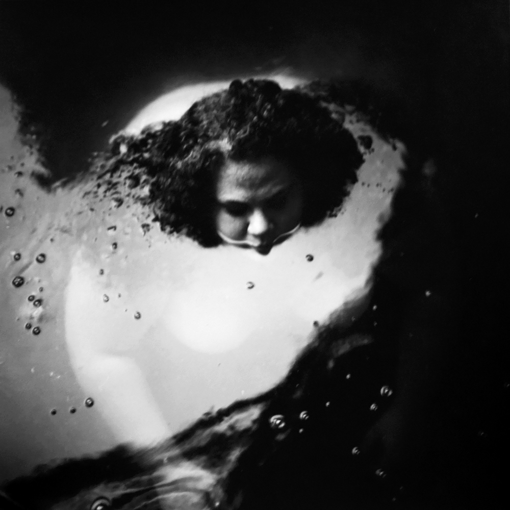
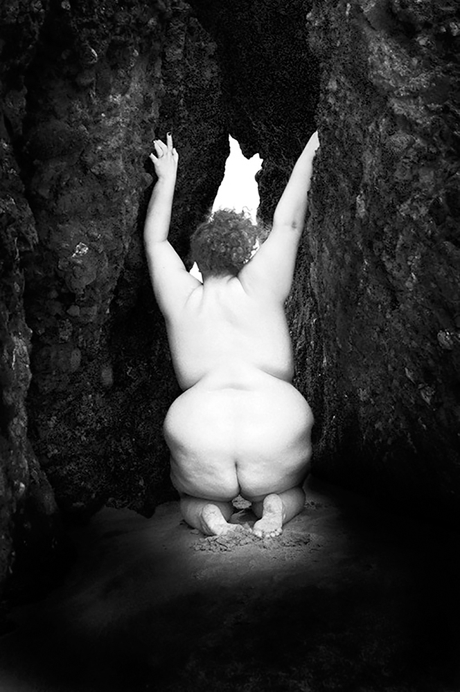
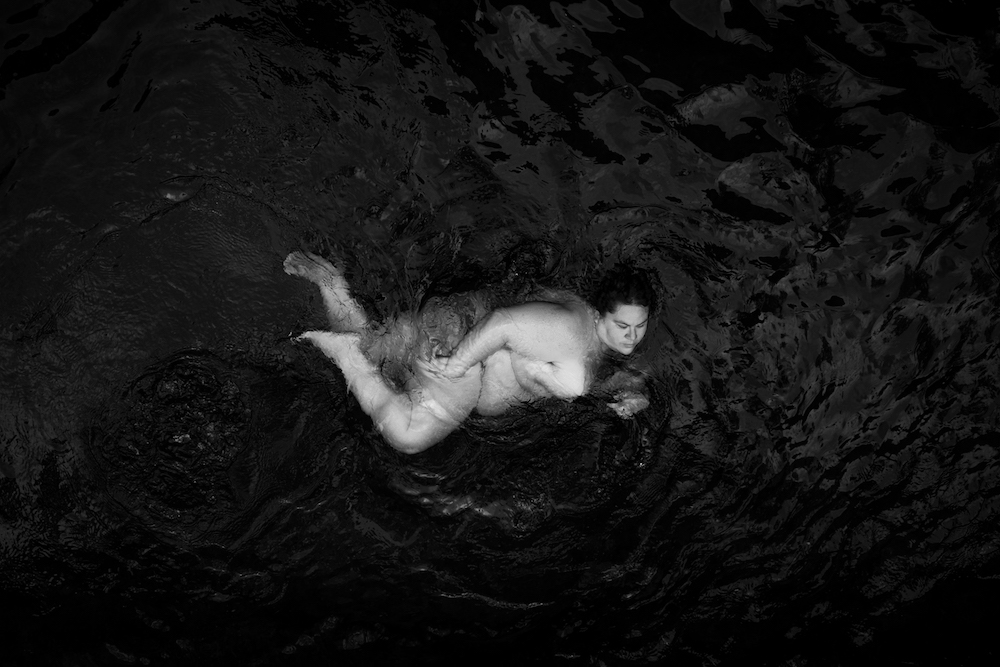
I believe Cathey-Adams intends to celebrate the fat female body in relation to nature. Nature is enormous and beautiful. No one thinks a giant mountain would be prettier if it were smaller. No one looks at a mountain and says, "That mountain isn't natural. That mountain shouldn't be there." Cathey-Adams correlates the enormity and beauty of nature to her enormous and beautiful body. She positions her body in such a way that it seems like she is a part of the landscape. She is a part of nature and consequentially its splendor. She is not relegated to the realm of the grotesque, lazy, or greedy because of her size.

3) how do you personally respond to these choices and intents?

I empathize and applaud Cathey-Adams for using her societal vulnerability as a strength in her art. Everyone at some point has wanted to reject their body, but Cathey-Adams shows her love for hers and makes me feel I can appreciate my own even more. Her portraits are more than the regular body positivity shots. Those types of photos say, "You should love me even if I look like this." Her photos say. "I love myself despite what you think of the way I look."


Hardi Budi - Nicole Plummer post 2


Budi’s images first caught my eye as I browsed the Lensculture emerging talents page. His choice of high contrast black and white, low saturation photos were instantly appealing. They felt very raw, in the sense of natural emotion, yet uncannily situated. The center weighted composition also conveyed an unnatural air, but still very pleasing considering I am drawn to symmetrical style. Lastly, the overall simplicity allows me to engage a deeper meaning within the photo and myself. If they had been crowded and complex I would have had less to expand upon in my mind.

Obviously, there is a ceramic tub, a dark background, and eerie arms draping over the edge connecting the series, but there are many more nuances, which allow curiosity to flow. While using the primary “tub” connection, it adds a sense of heaviness in combination with the mannerisms of the subjects. It appears the tub is a symbol of cleanliness in contrast to the dark black clothing, or chaotic facial expression. The uses of subtle contrasts, personally, build a bit of a story.  First, the emersion of arms exhaustedly reaches for the kitten. Next, the cranes represent freedom, yet they are flying away and the woman seems distressed allowing one to conclude: she is trapped. Following, there is a scene of out lash in pursuit of forcefully freeing oneself. Lastly, the woman has burned out from exhaustion.

I can only imagine Budi’s idea of his own images, but that’s what I found so appealing. His images are open and allow the viewer to decide the exact meaning and order they should exist or could exist. My idea of the images and their story they convey is only a reflection of my own life and experiences. These images spoke to me deeply, but only due to my own life and passions. Others may see nothing; after all, there is a limited amount of information available in the first place. Beautifully plain.

David Hockney - Abby Chambers - Post 2


1) Which of the artist’s many technical choices are of interest to you and why?

David Hockney has been my favorite photographer since I was introduced to his work in high school. I have always found his 'cubist' style of photography very interesting. I feel that it's almost a more creative way of shooting/presenting your work than standard photography. I enjoy the pieces in which  he creates his collages into a more organic shape, like the last two pieces I included in this post.

2) What do you believe are the artist’s conceptual and/or thematic intentions?

I believe his intentions are to show moments from more than one point of view. He takes different photos of the same scene at different angles and then pieces them together in an abstract way to show the entire picture in a way that one photo couldn't do.

 3) How do you personally respond to these choices and intents?

I personally love Hockney's work. He goes beyond standard photography to make a piece show so much more. It inspired me to create work similar to his and expand my style of photography.

Emma Doherty- William Eggleston


 1) which of the artist’s many technical choices are of interest to you and why? 

While reading about Eggleston, I learned that he scewed the perception of the viewfinder. Throughout his years as an artist, he's compared the viewfinder to a gun. He reminds artists that the image in  a viewfinder should be chosen with feeling rather than just "pointing and shooting." 

2) what do you believe are the artist’s conceptual and/or thematic intentions?  

Thematically, color has always been Eggleston's strong suit. He influenced artist with bright and saturated spectrums of color to enhance emotion and setting. 

3) how do you personally respond to these choices and intents? 

Personally, I value and worship color in photography. I am an expressive person myself and I think my work is so much more emotional with color. 


Julie Renee Jones- Niko fernandez


1) Which of the artist’s many technical choices are of interest to you and why?
Jones makes good use of optical illusions to create unique images that otherwise would not exist outside of a photograph. She also has a good use of perspective to give her images more depth rather than just shooting at the subject straight on. Which allows her to create surreal painting like compositions that one might assume are computer generated. 
2) What do you believe are the artist’s conceptual and/or thematic intentions? 
I think the artist wants to show abstracted human figures. Jones photographs stop and made me think about ways one can abstract the human from in a photograph using my environment, lighting, and other things in my surroundings without the use of photoshop. you have to really analyze the image and take it all in. 
3) How do you personally respond to these choices and intents?  
Personally I love the choices made here as far as composition. The way these photos were planned out were unique there is a lot of use for reflective surfaces to give these unnatural photographs that you wouldn't normally be able to see. Adding different perspectives and not looking at the subjects in a traditional way is what allowed for these photos to be captured as well using 
4) Why did I chose this artist?
I chose this artist because Julie Jones does a good job of documenting these unique abstract images and i was a fan of other work of hers as well. She lives in the midwest and most of her work is of the structures and people who inhabit that region of the united states. Her style is every interesting and uses a good contrast between colors. She's her work is good to take inspiration from when it comes to looking at things in a new perspective.  


Marlena Artis - Patricia Voulgaris post 2


1) Which of the artist’s many technical choices are of interest to you and why? 
The color palette used is a great choice for this artist's main focal point of her images. Voulgaris works with all neutral colored props, helping the image focus on the main subject: the human body. Also, she shoots in black and white yet manages to use a wide variety of the gray scale at the same time in every photograph. She keeps her scenes very consistent with the same types of material, mostly all with a smooth flat surface. She uses intense lighting, creating shadows and a high contrast to differentiate between the human body and her props. Personally, I am bias towards a neutral color palette for her exact purpose: eliminating distraction amongst the picture. Mostly everything in each of her photographs all have smooth surfaces in order to flow (or to not flow) with the texture of the human skin or hair, another reason why I am fond of her technical choices. Everything within the image and how it was shot all focuses attention onto only her subject.

2) What do you believe are the artist’s conceptual and/or thematic intentions?
Voulgaris has an obvious reoccuring theme throughout her work, she always uses the human body as her main point of interest in each photograph she takes. I believe she utilizes the human body in a sculptural aspect in order to show how parts of the body can interact and mold with inanimate objects of similar or different textures. This artist's conceptual idea stands far away from trying to simply photograph a nice looking body. Voulgaris wants the audience to understand that the body is meant for so much more other than just itself. She uses different parts of the body, fitting it into different spaces or corners, against or next to certain textures and colors. She wants the viewer to see how the body can be presented in different aspects. 

3) How do you personally respond to these choices and intents? 
I absolutely adore Voulgaris's work. I personally like to work with the human body as well so I can definitely resonate with her intent and ideas. Voulgaris shows a whole different meaning to the human body to me, giving me a different perspective to consider while shooting on my own. Her technical choices in how she goes about her compositions also introduces new ways I can work with the body. Specific textures and colors express the relationship between them and the body. Voulgaris's intents also help push me to view the body in different unique ways.


Sydni Stearns- Zoey Grossman Post 2

Photographer- Zoey Grossman

1.) Which of the artist's many technical choices are of interest to you and why?

I think that the artist's choice of color and accessories is so striking and interesting. She photographs models accompanied by a bold aspect such as a bejeweled face mask as seen in the first photo I have attached or bold colored lighting as seen in photos two, three, and four. I am obsessed with the vibrancy of the lighting used and I am often inspired by it while making my own photos. I have created a series of photos, myself, with a similar use of colored lighting so I am very drawn to this type of work. a She shoots various types of clothing on the models as well and the chosen items complement the photo so well. The items are never dull and often involve crystals or shiny aspects as seen in the photos below. Aside from the clothing, the makeup paired with the look is chosen so wisely and very well, in my opinion. Each look contributes to the overall aesthetic of the image. These photos are so pleasing to me and I think she creates stunning images.

2.) What do you believe are the artist's conceptual and/or thematic intentions?

I think that the artist strives to create a visually pleasing photo that is colorful and has a unique aspect to it that is primarily unseen in photography. Her vision is so different from others I have seen. She includes vibrancy and switches up the models, makeup, and outfits in such an enticing way each time. I think that is aiming to create photos that have a "WOW" factor and will make them want to see more of her work. She is always bringing forth new ideas and concepts which excites people and makes them want to see more.

3.) How do you personally respond to these choices and intents?

Personally, I believe that her photos are beautifully done. I am so inspired by the choices she makes. Her use of color, accessories, and clothing etc. is truly such a huge inspiration to me. I am almost at a loss for words when pondering what to say about her photos because there are just so many aspects that are so stunning to me in every way; from the makeup to the hair to the outfits to the lighting choices to the quality of the photo to the movement of the model/facial expression and everything in between. Zoey is such an inspiration to me and I definitely see my own style in her work.

4.) Reasoning of why I chose this artist:

I chose this artist off of Instagram because I look up to her immensely. She photographs for several magazines and is doing so well in her career. She is doing what I picture myself to be doing so it is so awesome to see a woman succeeding at such a high level in the industry. I am so inspired by her work and it makes me want to experiment with photos more and focus more on the lighting and accessories/clothing rather than the editing of the photo. I aspire to have the platform that she has and I will continue to follow her work as her career continues.


Ruben Pagan - Kevin Cooley - Still Burning


Kevin Cooley's project "Still Burning" includes images regarding wild fires in Los Angeles, one of which got close to burning his property, political smokescreens, environmental degradation, and the regeneration that hopefully follows any tragedy. His use of different technical techniques intrigues me. In the first image he uses long exposure of what appears to be the sun setting down to the horizon. It intrigues me because I'm curious as to how closed his aperture was considering the fact that he has a wide depth of field and the exposure had to be quite long with plenty of sunlight remaining while managing to make sure the photo wasn't overly exposed. In the third image, he also did a long exposure using a light source out of the frame and red laser pointers along with smoke exposed by the light to capture an essence of smoking embers of what remains after a wild fire. The color and liveliness of this image help give a positive outlook effect on life persevering after such tragedies.

I believe the artist's intentions are solely to grab the viewer through the usage of vibrant and subtle colors captured in powerful images on an issue. This was done in order to make one aware of the crumbing of our planet in an environmental sense. Also, he wanted to show that "life always endures, adapts, and continues. I believe he best captures that idea in the third image through displaying the perseverance of the plants through the smoke and embers left behind.

The artist's message is clear to me upon analyzing each piece in this project. I think that he portrays his message very well through the sole visual aspect that the lens provides to the human eye, or vice versa. I agree that it is important in today's society, not just in this country, to shed light on the environmental issues that we have set upon ourselves throughout the last century. Things will only get worse for the generations to come if we don't take a combined, serious effort to stop the harm we are emitting on our planet. However, the attention we should've given to this issue is long overdue.

Hana Pearlman- Shane Rocheleau – YAMOTFABAATA Post 2

1) I really enjoyed the technical decisions that the artist made due to the lighting. The first picture is what caught my eye.  
2)  I believe the artist's intentions were to paint a very ominous picture, almost paranormal, with the way they exposed the images, with the high contrast and the fog.
3)  The images below almost leave me with a sense of peace. The first picture has a particular movement about it that I am abousltuely drawn to. The second picture leaves me asking a lot of questions. What was this man thinking? Who is he? Why is his hair green? etc. I still find that picture very peaceful and intriguing. The fourth picture, although I find it peaceful I also find it disturbing, leaving me also asking many questions. What is that substance? Is it blood? Is it paint? Was it done on purpose?  


Sunday, September 2, 2018

Denver Edmonds - John Edmonds (Anonymous Series) *post 2*


1)  Technical decision and why I'm compelled/moved by said tech decisions.
Anonymous is a series based upon the social injustice black communities. One thing that intrigues me  about this piece is the items on the subjects and how it relates to black culture. The subjects wear durags, which are garments wore on someones head to keep their hair in place. It is typically and commonly worn by black men. They also wear hoodies and it pertains to the event that sparked a movement among the black community. In 2012, Trayvon Martin was killed in Florida during the night. His murderer claimed Martin looked suspicious because he was wearing a hoodie. 


2)  What I believe the artist's intentions and concept are.
The hoodies and the durags conceal the identity of the subjects. I find this interesting because it displays how the artist feels as though black identity is viewed differently by other races. Black identity has no distinction in societies eyes, which can be dangerous. The black community can have individuality because it is dynamic!  The neutral colors of the subjects in hoodies shows the dullness of ignorance towards black individuals. Yet, the durags feature bright colors with lust texture. This alludes to the beauty of black individuals and the community as a whole. 


3)  How do I personally respond to the intentions and concepts.
I enjoy the subtlety of the piece and use the color to demonstrate themes. My interpretation was easy to gather because of the technical decisions, but the concepts are sophisticated and relevant to the turmoil of America and the black community. This pieces celebrates blackness, individuality, and the social structure of America. I feel as though it would have been interesting if the subjects wearing the durags revealed part of their identity within a different pose. However, I understand the theme of being anonymous  and having consistency within a piece. 

4) Why I chose this artist

I chose John Edmonds because I like how this piece strives towards eliminating the distance between societie's understanding of blackness and black peoples understanding of blackness. In person, this series is displayed on huge scale, which forces the audience in the context of the series and the work in general.The references and iconography also highlights this piece. In my opinion, John Edmonds made brilliant decisions to create a piece that uplifts and enlightens viewers.