Photographer Hal is a Tokyo based photographer who specializes in the following themes: bathtubs, couples, love and challenges. He is very interested in seeing couple in tight intimate spaces which led him to photographing in bathtubs because he believes the bathroom is one of the most intimate places for a person. By confining his subjects to these tight spaces, he was given a while new world of expressions to view within the dynamic of a relationship. Most of the photos are done in the home of the subject he reveals, causing me to believe that the amount of available light would often being challenging for him. Under this impression, I believe he brings a light with him to balance his exposure out. Considering how detailed the photo is even in positions such as the third one where the subjects seem to be on a deeper tub, I believe a mid-to-deep depth of field is needed to achieve this clarity. This is what causes me to believe he brings additional light with him as the shutter speed would potentially need to be much slower to get the proper depth of field. I found these photos intriguing because I did my own set of bath tub photos a few weeks ago. This have a whole new way of photographing this intimate space that I had a not imagined before.
Monday, April 27, 2015
Ayana Chavis - Weekly Artist Post
Dobson employs an excellent depth of field to capture these young Afghan skateboardettes. With a somewhat balanced aperture between very open and closed, she finds the right point to keep these girls in focus but still capture the environment in which they skate. Her use of relatively quick shutter speeds also capture them as they ride their boards. Dobson also strives to make sure her images are of great quality.
The inspiration from this project stems from the social issue of women not being allowed to ride bicycles in Afghanistan as a respect to their religion and social order. However many Afghan girls and woman have taken to riding skateboards as a early outlet to break the barrier of the rule through the program Skateistan. The program aids in reentry back into schools through formal learning and training, hot meals and 1 hour of skate time for mostly low income children. Woman are now the number one skaters in the country.
These photos give me hope. I feel so much that in our capitalist mindset of a system nothing that has not already been introduced into a traditional society hurts so called "third world" countries more than it helps them. However, the joy on these girls faces as they skate says otherwise. I think Dobson captures the essence of such a phenomenon although seemingly rare as a change that could really happen in we use or technologies and innovations for good and not greed.
Weekly Artist Post
Mariya Kozhanova
In all three images, Kozhanova has depicted women wearing colorful and extravagant wigs. The way they are framed almost makes them look like mystical characters. This can be seen in the first image, where it is so perfectly taken to look like a typical scene from sailor moon or kingdom hearts. I believe Kozhanova may have Kozhanova even asked the girl in the blue on the left to raise her arm in order to create a balance working with the staff in the hand of the girl on the right. The naked female in the second image also almost looks like she is from a magical world, but this only possible because she was probably instructed by Kozhanova to hold open the door while immersed in her wig to create a contrast between the darker-right and lighter-left side. In the third image we can see this as the woman is framed so well by elements of different types and textures and by their reflections.
I said almost because although there are very surreal aspects to each image, there are always things tying them back to reality. In the first image, everything about the image is magical, even the rusted rooftop could fool me, but for some reason it seems like the Kozhanova didn't edit the photo much at all, leaving it sort of bleak for such a dramatic frame. If you were to put your hand over the whole right half of the second image, the woman looks like a spectacularly naked princess or fairy. If you were to do the on the left half, she would look like an ordinary naked girl wearing a wig in her living room. The thing that ties the third image back to earth is the earth itself. By that i mean that the nature makes it seem like its a very great image of an ordinary world.
I believe Kozhanova is exploring the struggle that these people face as they to try and bring excitement to a boring or typical world that they dont understand or dont want to understand. This can be seen clearest in the second image, as the girl is naked both physically and ideologically and either sides of the room represent her separate choices for identifying herself.
Last Artist Post- Selasi Fynn
Shikeith
Shikeith is an artist based in Philadelphia. Apart from photography, he is also a sculptor and a film and video maker. Looking at these three picture, it's easy to think that they're all from the same project, but they were taken and displayed at different times, with the first one from 2013 and the second tow being in the same project and taken in 2014. That being said, Shiketh has a very distinct style, and I'm sure many who are familiar with his work would be able to point out his work.
In his bio on his website, Shikeith explained that he was criticized a lot growing up and his masculinity as a Back man was questioned, mocked, and said to be almost non-existent by the boys he went to school with. This is obviously an ongoing project/theme for Shikeith: finding different ways to challenge the stereotypes of masculinity in society, with the Black community being one of the main targets and maybe finding different ways to portray what he sees masculinity as, as a Black man.
I find the second and third pictures really really interesting. Shikeith has more photos from this specific project and these two are my favorite out of all the selected work he has on his website. When I think of a black and white picture, I often think some something very static looking, with a lot of noise, or, if it turns out to be an interesting picture, like Kirsty Mackay, it's not of people. In the last two pictures you can see the depth and texture from the subject,and you almost don't even need color to show it. I really enjoy the way Shikeith uses light to create depth and texture within his photos, but also makes sure to keep the faces in the shadows. It makes me think that he wants to break the stereotypes of masculinity not just for himself, but for other Black men.
Lindsey Mott - Weekly Artist Post
Federico Clavarino
The framing of "Ukraina Passport" is extremely intentional for candid photographs. Clavarino is paying attention to exactly who and what he is photographing, although the photographs might first appear unplanned.
Based in the name, it's easy to conclude that this series deals with travel on some level. However, these aren't just photographs of the photographer's trip to Ukraine. This series deals with the tension of seeing both what people want you to see and what they don't want you to see. Coca-Cola trucks, people washing their hands in storm drains, paint peeling off the walls. The photographer is a tourist but he is not photographing tourist attractions. Nothing about these images scream "Ukraine," so why is this the "Passport"? These pictures could have been taken virtually anywhere.
I like that Clavarino titled this series as if it had something to do with travel, when it is really dealing with something much more conceptual. This is inspiring, because it serves as a reminder to photograph subjects that people typically wouldn't and to search for intrigue in unexpected places.
Sunday, April 26, 2015
Artist Post - Helen Westergren
Sarah Hermans
Sarah Hermans is a photographer primarily working in Belgium. While she doesn't lay out a specific scope for her work, most of her images deal with architecture and the beautiful spaces around her. She primarily shoots with a Pentax 6x7 meaning she scans in everything she works on. Because of this it is hard to speak technically about her work in the same way we can for digital work, but clearly Hermans is intentional. From framing to color choices, everything she includes in the image serves to showcase the best narrative or depiction.
Hermans' work shows a unique type of beauty I've been interested in recently. There are many elements that are classically beautiful, like the texture study in the middle photo, but they also possess a modernity and shift that is not always thought of. In looking at her work there is a clear study of immediate environments and unposed moments. The colors she uses are fairly desaturated, favoring one or two bright moments instead of a hyper saturated image. It's hard to put her work under any type of conceptual theme and it feels unnecessary to do so. Her online presence is very minimal, just a lot of images, so it is hard to really understand what she is trying to do with the work.
As said before, I'm really interested in the beauty of these photos. They may not be totally new or groundbreaking but they have a certain presence I'm continually drawn to. Her images have also encouraged me to think about whether or not beauty is enough, specifically within the photographic context. Sure there will always be a generally positive response to beautiful things, but the medium demands more than that to truly say something important. I love Hermans' images but I'm not sure they move beyond this place of being nice to look at.
Friday, April 24, 2015
Final Artist Post
These photos were made by French photographer Elliott Erwitt (http://www.elliotterwitt.com/lang/en/index.html). In looking over these images, the first thing I noticed was Erwitt's interesting variations in framing. He chooses to take creative angles and display his subjects in ways that make the viewer ask questions about the images' contexts.
When I look at Erwitt's images, I find myself questioning not only what's in the frame, but also what's missing from it. It feels as though Erwitt is trying to mask something, or at least cause his viewers to think about the images in a different way. Each image correlates to the next through the theme of masking, whether in shadow, lack of focus, or by an unknown obstruction. This element of hiding adds a mysterious dynamic to each image.
In addition, Erwitt does an excellent job of utilizing light sources in a creative way. This is especially prevalent in the middle image. Angling the subject's face in a way that places one side in shadow reinforces the idea of masking. Through this repetition of themes, Erwitt excellently connects otherwise seemingly unrelated images.
Thursday, April 23, 2015
Weekly Artist Post
Stefy Pocket
Stefy Pocket is a photographer from London and these photos are from her series Jamaica Mi Crazy. Pocket's photos are colorful and carefully composed. For most of her photos, she appears to use a closed aperture to achieve a deep depth of field. In some of her photos it looks like the subjects could be moving, she she might use a fast shutter speed to stop their movement. Most of her photos are taken during the day, so Pocket probably uses a low ISO to get high quality.
Pocket wanted to showcase the vibrancy of Spanish Town and empower the people who are often pitied or looked down upon. Pocket remarked how happy everyone was who lived there, and she wanted to capture the spirit of the phrase "Jamaica no problem." One way she does this is by often photographing her subjects from below, placing them in a position of power.
Overall, I like the colors and composition of Pocket's pictures. I like that she chose to highlight the happiness of this culture, rather than the poverty.
Wednesday, April 22, 2015
Ashley Kronsberg weekly artist post
Francesco Romoli
Romoli's series "Dark House" is achieved by using both Polaroid and digital techniques. I was drawn to this series because of how intentional and manipulative Romoli has to be in order to attain his photographs. I still struggle with making the picture instead of happening upon a scene and taking it, so seeing someone put so much effort and thought into it before moving forward really helped with that. Since the photos are of models and highly manipulated, I believe he has lamps he could adjust to get accurate lighting so he could have a deep depth of field to capture all of the details in his models.
Ratcliffe- weekly blog post
These photos are taken with really nice lighting and color. They are very sharp which means a high Fstop. The motion is captured which means a slow fast shutter speed to capture the moment and freeze it. This is also high quality so there is probably a low ISO
The photos are to capture an infants first swim, to promote water safety!
I really think these Photos are cute, but im not really seeing the water safety promotion part of these photos... But they are really beautiful photos!
Tuesday, April 21, 2015
Mary Pforr- Week 12 Artist post
Artist: Sungsoo Lee
Photo Cred: sungsoolee.com
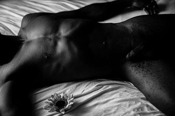
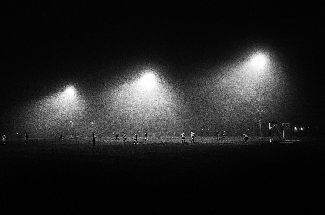
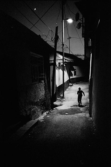
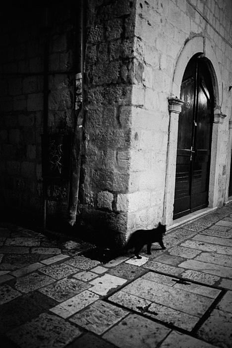
i. These photos and the majority of Lee's work are incredibly underexposed, and obviously, black and white. The under exposure and high contrast create extreme contrasts and shadows giving each photo almost an infinite depth to dark. The lighting is very selective and emphasizes the subject.
ii. There is a constant focus on form and hierarchy. The lighting shines on the subject in the photo and the hierarchy goes downward with the contrasting shadows.
iii. Though we have not had any experience with black and white photography in class, I very much enjoy underexposed photos that create dynamic contrast such as these.
Monday, April 20, 2015
Weekly Artist Post - Tyler Zheng
Terry Falke
My first impression for Falke's work is perfect exposure. He's more of a landscape photographer, most of his work involves wild/desert + abandoned man made structure. For sure most of these landscape photographs were shot with a deep depth of field, while keeping the shutter relatively fast since the nature is so changeable.
Falke presents the relationship between the work of man and nature. Usually people would think it's something negative, but I think I see more of a coexisting vibe through his photographs. The man-made object tend to blend in well, and become part of the nature.
His work gives me some idea about the proejct that I'm working on for the semester.
Weekly Artist Post
Jessica Fulford Dobson
Celebrated
British Portrait photographer, Jessica Fulford Dobson, chose to capture the
subjects in low light and as they were without interfering or setting up
anything official like an artificial light. There are many portraits in this
series taken in the same scene of both the first and third image. This
composition lends itself to a portrait as the leading lines are coming in the
from the bottom left, top left, and top right corners to converge on the middle
torso, highlighting the subject. Also in this area there is a soft natural
light coming from the windows on the left and touching the subject. What i like
about these portraits is how they a natural sense of personality. Sure, the
subjects are standing in a similar area but they don't seem posed at all. By
putting them in this similar area she is encouraging the viewer to focus on the
subject's expressions and the difference between each one. In the middle image
she has caught the girl at a semi-fast shutter speed. I say this because only
the middle of the girl's body is in focus and not being motion blurred. The
composition of the image is great though, as captured the photograph right at
the moment when the girl was under the window that has reflected off the ground
to create an outer glow or highlight for the subject's body.
In one of the most
oppressed countries for women in the world, i found these images telling a
unique story of female empowerment within a segregated and oppressive
society. Beyond the physical benefits,
sport empowers girls to build leadership skills, confidence, and in this case,
challenge gender stereotypes. It is clear from each and every image
that these girls are beaming with confidence. In the first image the girl's gaze
shows a defiant confidence. In the third image you can see the confidence in
the girl's grin along with the way that she holds the skateboard as if it's a
trophy.
In
Afghanistan, girls and women are forbidden to ride bicycles, and restrictive
clothing often keeps them from enjoying other sports, but skateboarding has
quickly spread throughout the country, becoming the nation’s number one sport
for women. Dobson recognized this and decided to take advantage of the
situation. By using girls that, in afghan society, are quite difficult to
access, let alone photograph, in conjunction with skateboarding, she has found a way to a
new way to symbolize freedom and celebrate empowerment.
Erin Copeland- Weekly artist post
Elina Brotherus
Elina Brotherus is an artist and photographer. Her work is based on the figure and classical painting ideas. The first image is from a series where she documented the birth of her best friends child. The second two images are from "Model Studies" where she photographed her models based on classic painting.
I picked Elina Brotherus because of her way of photographing the human body. She also pays attention to light and color in her work. They really evoke the feeling of the classical nude and I think that is an interesting concept.
Ayana Chavis - Weekly Artist Post
Deborah Willis
These photos were a part of a 2003 and 2004 series, entitled Embracing Eatonville: A Photographic Survey. Depending on the subject Willis is photographing she decides whether she should open or close the aperture. For portraits she typically employs a shallow depth of field and landscapes are more so captured with a closed aperture. Her photos are of higher shutter speed considering her images are clear and of good quality indicating a low ISO.
Thematically, she seems to have a central interest in black communities. This particular series is about one of the first established black towns in America, Eatonville, Florida. With this series, Willis captures the landscape but also avenues of black life such as the hair salon, their cars, and beliefs. All these things are avenues that give many black people joy and happiness and definitely speaks to black culture in the south.
Personally, as I see more and more photographic works I have realized that I love photos that portray reality instead of an idea that one is trying to describe. Willis' work captures just that. I feel a part of her photos and experiences in Eatonville, because she captured a very common area of black life, a collective experience.
Sunday, April 19, 2015
Weekly artist Post- Selasi Fynn
Gordon Parks
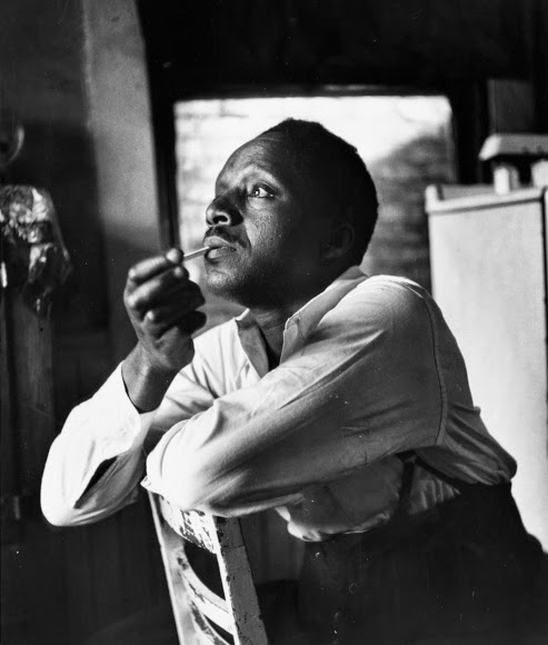
Gordon Parks is an American photographer. All of the pictures above are from his project titled "Back to Fort Scott" as Parks was born in Fort Scott. Kansas. I feel like Parks was trying to portray his life in Fort Scott when he was younger b y going back and taking these pictures. Out of all of Parks' projects on his website, only two are in color. One title "Later Abstractions," and one title "Segregation story." So obvious one of his main themes or ideas was to capture history, more specifically, the civil rights movement, while taking absolutely everything into account, color included. That being said, I really like the way back and white looks in the first picture. The subject's face is highlighted and you can tell that natural light was probably used in the frame. The second and third picture look a bit washed out to me. I feel like its very noisy and I wish they were in detail like the first photo is.
Subscribe to:
Comments (Atom)


