Thursday, October 11, 2018

Emma Doherty - Irving Penn

1. Which of the artist's many technical choices are of interest to you and why?

One of his techniques I remember studying in high school and being really interested in is his platinum prints. He would coat the paper by hand with platinum salts. The negative is placed on the coated paper which exposes the negative to the chemical reaction. I just think that using a negative beyond its necessity is adding such intensity.

2. What do you believe are the artist's conceptual and/or thematic intentions? 

Penn worked on completely different projects from commercial, books, fashion, still life, etc. He was forced to constantly evolve his thematic intentions. He was consistently trying to reinvent basic photography settings. For example,  He was known for producing exotic fashion shoots which  not only made it about the clothes but the emotions of the models when they wore those specific clothes.

3. How do you personally respond to these choices and intents?

I tend to look at him for inspiration especially when i feel stuck. He would be working on different projects but using his old projects to influence the current ones. He would go back to his old prints and reprint them in different formats with either platinum, palladium, etc. Throughout the articles I read about him, he was continuously described as trying reinventing himself.


William Ferris-Madeline Edwards


pg82_club

20367_3001_ 014

20367_box10_ 018
20367_3002_ 018
20367_3002_ 012
1. Which of the artist's many technical choices are of interest to you and why?
I am interested in the artist's use of color in his photographs of the American south in the 1970s because of the connotation "color" had at the time. In using color we literally and metaphorically no longer see the people of the south as black and white, as even they may have seem themselves at the time. The use of color also reminds people of how recent the past actually is. With advancing technology, growing populations, gentrification and development its easy to believe the south that exists now is completely separate from the south that was. I am also interested in Ferris' focus on a single subject. People and places are not blended into a generic stereotypical view of the south, rather we see these people and places as relatable individuals. 
2. What do you believe are the artist's conceptual work and/or thematic intentions?
I believe the Ferris intended to attempt to capture the same, unique culture of the south shared by different people. Though each subject is individual, the viewer understands that each separate photograph in some way relates to every other photograph taken, through the similar use of details such as background, color, clothing, and composition. 
3. How do you personally respond to these choices and intents?
I am from what may be considered the deep south, Georgia.I grew up around similar backgrounds, very green trees , blue skies, with a penetrating sun, red brick and dilapidated buildings. In a sense even the people are the same. It makes me wonder how much the south has actually changed in the last almost fifty years. I feel like apart from my clothing I would fit right in one of these portraits of the south. Ferris somehow manages to capture the spirit of the south, the spirit that lives in the earth and climate and effects the way people live, dress, build and express themselves. That spirit will outlive the people who settled there. 

Brezaja Hutcheson - Giacomo Brunelli - Post 7

1. Which of the artist's many technical choices are of interest to you and why?

I am interested in how Brunelli uses high contrast in his pictures, considering the placement of light and dark, along with analyzing how the two work together in the frame. Brunelli approaches the composition of his photos in a manner that is almost geometric - the soft focus of the objects in his photos creates an element that almost renders them unintelligible,  which is an element that I admire because I feel that it creates a sense of mystery, along with the already eerie element that most of his photos contain.

I also appreciate that his photos are captured on BW film. The grain of the film gives the photos a tangible quality, making them appear less flat. Each photo seems as though it could have its own narrative, or is part of a much bigger story. 


2. What do you believe are the artist's conceptual work and/or thematic intentions?

I believe that Brunelli does try to create an environment for each of his photos. In each of his  photographic works, it appears that they have their own "mood", meaning that they can be interpreted in numerous ways. 

It is easy for one to dismiss these photos as mundane or lacking substance, but I feel that his intention was to capture the happenings of everyday life - no matter how big or small. Within each "world" that is captured in these frames, there is something that can be said about each of them - whether it deals with content, composition, or the subject matter. I believe that Brunelli wants his audience to consider all of these elements while viewing his work, while perhaps consider the fact that art comes in many forms, and there are multiple ways to interpret what can be considered art.


3. How do you personally respond to these choices and intents?

Personally, I find myself drawn to Brunelli's photos. I admire the fact that he is able to evoke a specific mood using the subjects that he depicts, as well as the aesthetic choices that he makes in capturing these photos. I find myself particularly drawn to the high contrast between the bright lights, and the black darks in his photos.  There is also a sense of solitude that I feel while observing these photos, due to the fact that there is usually one subject in focus in each of his works.


Schuyler VanSyckle - Brandon Woelfel - Post 7

IMG_6488.JPG
IMG_1722.JPG
IMG_3017.JPG
IMG_5754 2.JPG

Photography By Brandon Woelfel 

1. Which of the artists many technical choices are of interest to you?

His use of color and light is what interest me the most about these photographs. After learning about the importance of color and light in each photograph makes me pay more attention to what picture I am making. These photographs inspire me and show me new ways to incorporate light and color into a photograph.

2. What do you believe are the artists conceptual and/or thematic intentions?

I believe that Brandon's intentions are to create an image that puts focus on the color and lights being used in these images. Brandon uses both color and light to draw the viewers eye around the image. I believe that his intentions are to capture the light and color that is being portrayed in the image and not what the model is doing.

3. How do you personally respond to these choices and intentions?

I personally respond to these photographs in a positive way due to me being drawn to the techniques that he uses. Brandon has always been a photographer that I've loved and enjoyed yet I have never looked at his photographs in a way of learning from them. After learning about the importance of light and color in each photograph we make I now look at Brandon's images in a learning sense and use his techniques in my own photography.

Mariela Gavino - Samuel Burgess Johnson - Post 7


Samuel Burgess Johnson

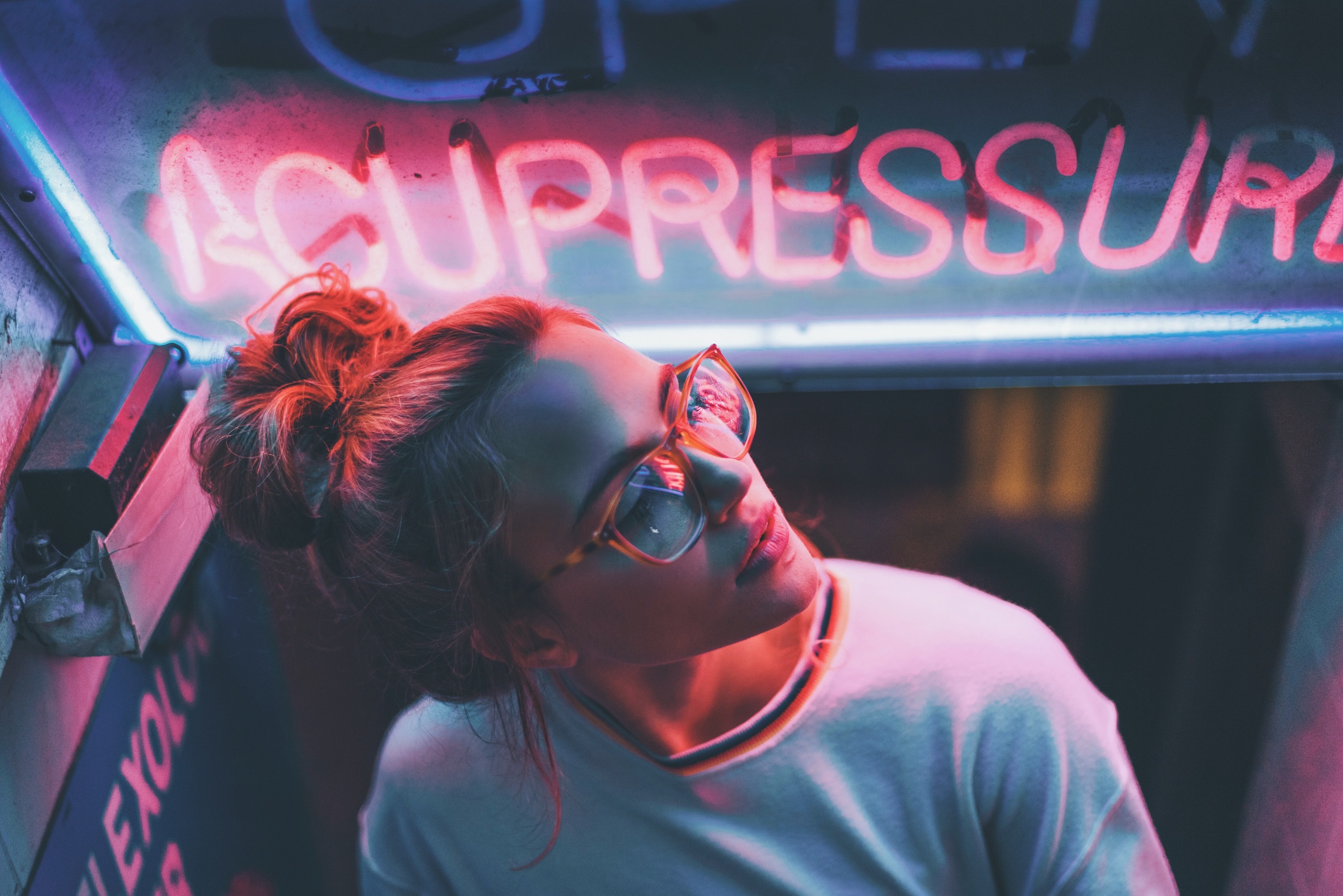
As we've been focusing on light and color in class, I was reminded of Samuel Burgess Johnson's neon light series as commissioned by the 1975 for their second studio album. I was compelled by Johnson's utilization of a bright, pink neon light against industrial spaces. The pink glow seems to wash into other areas of the scenes and it moves my eye around to explore the space. Johnson's consideration in composing the neon light in the shots communicates that everything around it should be studied as well. The lights are not close up or demanding the viewers attention with wide space all around it. His compositions allow movement in and out of the glow to other spaces such as the buildings or descending walls of the tunnel. The high contrast and diffused light also make it seem as if these scenes are in a dreamscape.

I believe Johnson captured these neon signs in these specific landscapes to create an almost surreal atmosphere. The signs aren't advertising anything like a regular neon sign is popularly used for. Instead Johnson is creating a mysteriously inviting narrative where the signs look out of place, but some how the content of the signs can be connected to the location. There is also a sense of isolation in the way he composes his shots. The signs almost become characters, alone and different from the space. Although this series was commissioned to pair with an album, the photos have impact even as a standalone piece.

I am most compelled by his lighting techniques. The use of this glowing, beautiful light in these mundane places makes me want to consider location more and how it also can become a character in photographs. There is a sense of unity and harmony that really allows me to sit with them for a while. You can feel the misty air that Johnson captures in the diffused lights. Theres just something really strange about seeing a perfectly engineered neon light in these places. It also makes me consider the connection that the words have to the landscape as well as the album they were made for. There's a lot of layers and ways you could sit with these photos and Johnson successfully leaves it open-ended.

Randal Ford - Nicole Plummer Post 6


For me, photographing animals both small and very large in a studio is incredible and mindboggling.  Not only does he photograph large animals, but also potentially lethal creatures such as lions, tigers, and bears.  Ford also has several black pelted animals against a black background.  This allows the animals’ beautiful eyes to be drastically magnified.  The technique also lends itself to display the subtle textures of the feather or fur against the smooth backdrop.  Breathtaking photos have come from these bold decisions, which could have even been the death of Ford.

Randal Ford makes his conceptual intentions very clear from his artist statement which says, “The book is my perspective and portrayal of the animal kingdom. As a portrait photographer, my intention is for these animal portraits to speak to you. What they say depends on the conscious and subconscious feelings you embody.”  I definitely get that anthropomorphic feeling from his chosen poses for animals which have human-like features. Overall I feel his concept is straightforward and strong by removing animals from their environment and placing them in a neutral setting for the purpose of humanization and self-reflection.

Lastly, I am a huge animal lover and was instantly drawn to these images the moment I saw them. I could truly feel the power or innocence of each animal from the closeness of the images. Additionally, I greatly appreciate the overall project itself. Ford has stated that all of the proceeds of his book sales go to Project Survival’s Cat Haven, a park dedicated to the preservation of wild cats. On top of all these wonderful endeavors, the project took 5 years of careful decision-making, safety training, and care to make sure the images were absolutely perfect for displaying the magnificence of each animal.

Ruben Pagan - Marc Yankus - The Secret Lives of Buildings


In this series of work titled "The Secret Lives of Buildings" by Marc Yankus, different types of architecture from New York City are on display in a new way. Yankus provides us with a unique view of these buildings through the use of "digital collage" and specifically the emphasis on just the buildings. He took the time to make sure there were no or few people in many of the images to evoke a sense of calm and quietness in an ever-so alive and active city. Not only did he manage to exclude people, more importantly there are no cars! It is hard to imagine any city without cars but especially New York City with the yellow cabs which seem to be a staple of the iconic metropolis. The manner in which Yankus framed the buildings in each still image is extremely important, specifically how the lines and edges of the buildings are lines up evenly with the borders of the photographs.

The artist's thematic intentions are to create a sense of solitude amongst the buildings in the city. This is because of the fact that people only ever see the city in such a busy state. He wants to provide the viewer with something that they would otherwise never see. The surreal, imagination-like scenery also provides a podium for emphasis on the forgotten buildings of the city that are overshadowed by monstrous skyscrapers. Everyone simply walks by old buildings that used to be the marvel of their time when they defined the city. He wants to show that these structures still shape the city into what they are today and that their archaic styles are equally beautiful.

I personally admire the intents of the photographer to show the city in these lonesome ways. I have actually wondered before what it may be like to walk amongst the city in a post-apocalyptic time with no one around and mother nature beginning to grow back into the city. Vines and weeds wrapped around buildings and lining the streets, deer running around time square, and complete silence with rusty cars everywhere and a bird chirping echoing down long streets through the tunnels of buildings. The world we live in today could be turned totally upside-down if the artist's decisions became reality and I am here for it.

Monday, October 8, 2018

Marlena Artis - Viviane Sassen post 7


1) Which of the artist's many technical choices are of interest to you and why?
The first aspect that I noticed in Sassen's series, "Roxane II", is that her photographs are multimedia works as well. She includes paint on the actual physical print of the photograph, as well as incorporating paint on her subject in the photograph. Also, it's really interesting to see how Sassen has composited all of her photographs. She utilizes lighting, shadows, colors, and a unique point of view while shooting the subject. For example, in the first photograph I shared Sassen shoots the silhouette of the female body on a material that the female is holding herself. I admire her use of shadows because Sassen uses them as a means of adding more depth to the subject. In her series, she expresses how these elements can come together to create a much more playful mood. 


2) What do you believe are the artist's conceptual and/or thematic intentions?
I believe Sassen's concept with her, "Roxane II" series was to accentuate the female body in a sensual way - but not in a hyper sexualized way either. In other photographs, Sassen has her subject sometimes curled up in odd positions. I believe Sassen is expressing feminism as well, being that many of the photos are manipulations and paintings of the female genitalia. Prior to reading interviews on Sassen, her intention was to express her friendship and relationship with Roxane as well as the former. 


3) How do you personally respond to these choices and intents?
I love Sassen's playful and creative aesthetics throughout "Roxanne II". Not only that aspect, but it's a personal bias of mine for her series to be portraiture work. I've always been fond of the human body, as fascinating as it is. Her use of casting shadows to create organic shapes across her subject is quite innovative in my opinion, since I've never seen somebody intentionally utilize it like that. It's a very new and interesting concept for me to create a series based on the relationship a photographer has with their subject. This gives me a new reason or intent for photographing certain people. 

Friday, October 5, 2018

Madeline Edwards-Cindy Sherman

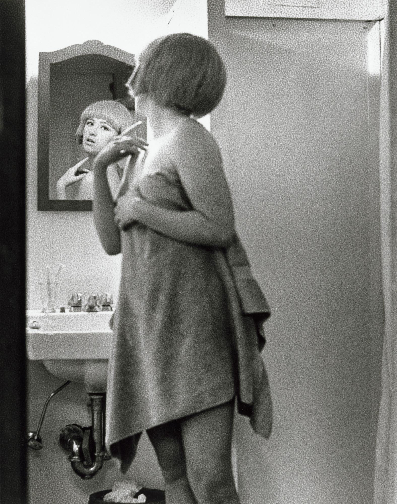
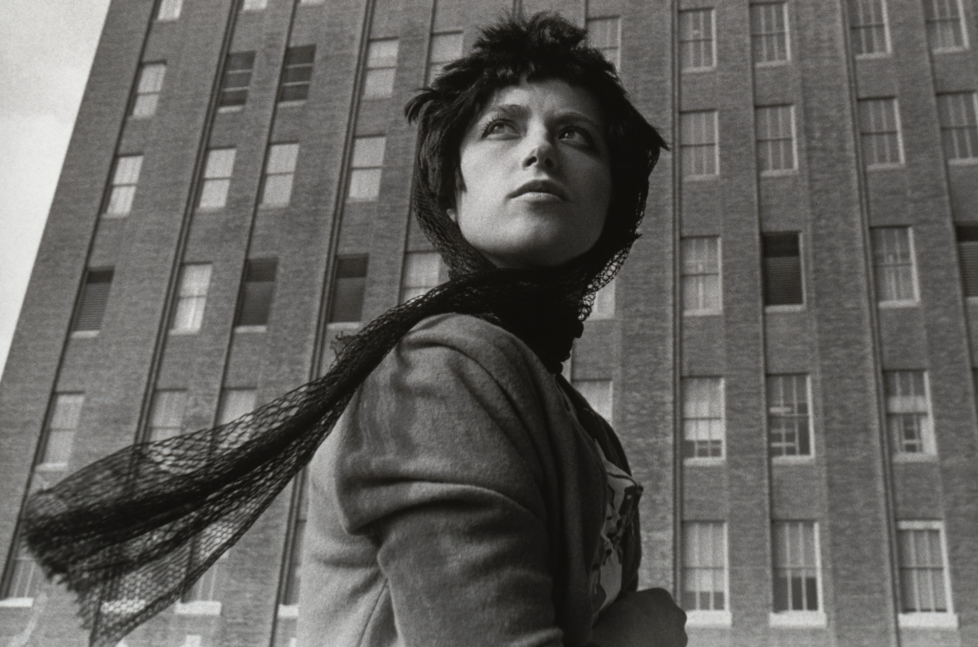
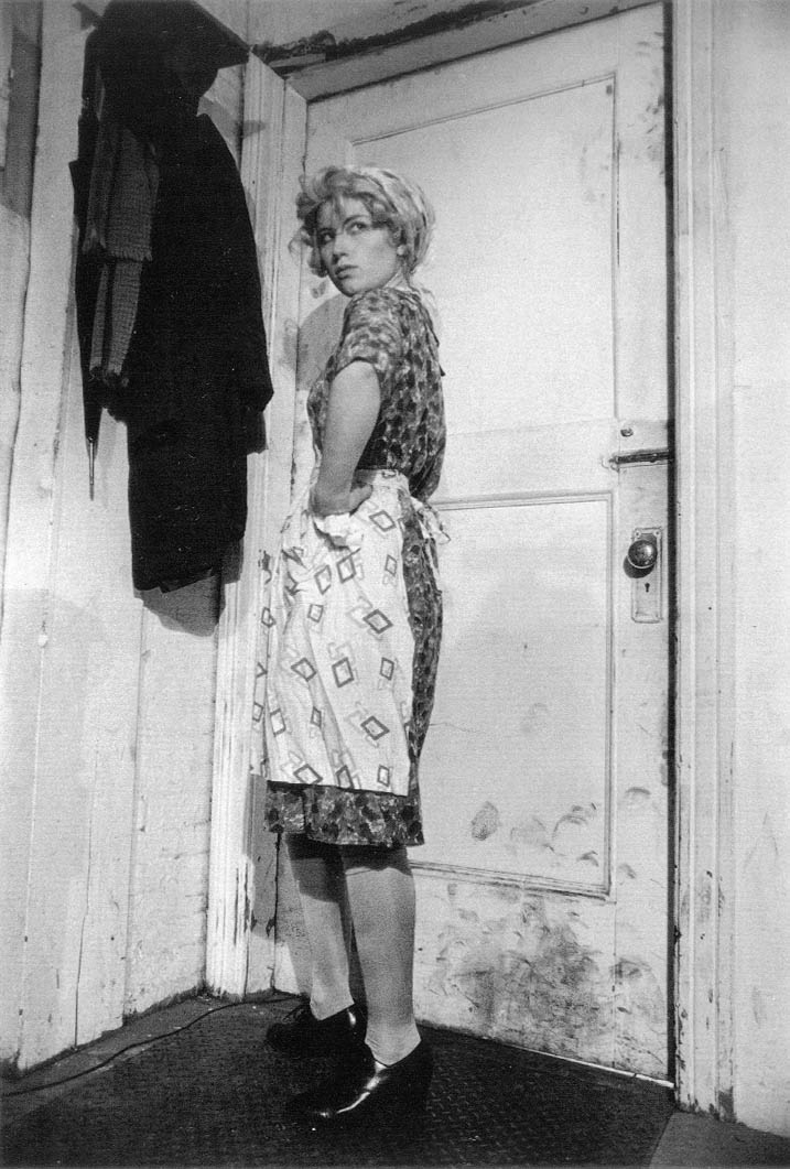
Image result for cindy sherman untitled film stills
1.Which of the artists many technical choices are of interest to you and why?
I am interested in Sherman's decision to create self-portraits. Somehow removing the male gaze from behind the camera emphasizes the ridiculousness of Hollywood scenarios. These photos are not made by a man objectifying a woman for the fantasy of the male gaze. They are made by a woman objectifying herself as a way to subvert the fantasy of the male gaze.

2. What do you believe are the artists conceptual and/or thematic intentions?
I believe Sherman's intention was to reveal the absurdity of the narrow stereotypes and tropes women have been forced into through out history in art and literature. Sherman, a very real three-dimensional woman, appears very two dimensional, both literally and metaphorically, as she photographs herself taking on classic personas delegated to women. At times she appears as a damsel, at other times a hero, but never as a realistic depiction of a woman. Though these male-oriented stereotypes of women are ridiculous and fictitious, real women may take on these roles consciously or not due to the sheer pervasiveness of the male fantasy in a patriarchal society. Often these fictitious roles are forced upon real women by men other times women may take on these roles as a survival mechanism.

3. How do you personally respond to these choices and intents?
There is a lot to unpack in these photos. I was drawn to the photos because of their Hollywood seduction, but they stuck in my mind because of their conceptual intent. I am not sure I fully understand the meaning of this particular work. These photographs deserve more contemplation than I am giving them for the purpose of this blog. I believe to fully comprehend this work I will have to continue coming back to this photo series over a period of time. Even then I'm not sure if I'll completely grasp, Sherman's conceptual intent. These are the type of photos where no matter how many times you look at them there will be something new to see and ponder. 


Sydni Stearns- Cole Sprouse Post 6

1. Which of the artist’s many technical choices are of interest to you and why?

I think that Cole’s choice to include vibrant colors really draws me to his images. His photos commonly feature a very blue sky and colorful clothing or scenery. I love this style of editing and it is something I try to do, myself, sometimes when editing my photos. I think that vibrant colors mixed with a more subdued clothing aspect or landscape creates such a beautiful photo. I also really enjoy the mixed media aspect of his work as seen in two of the images I have attached below. He paints on his photos and highlights or obscures different sections of the photo. I think this is such a cool concept and makes his photos very interesting and pleasing to look at. I think that the compositions of his photos are wonderful. I really enjoy the composition of the second and last photos I have attached below. In the second, the model is centered in the frame so well and is creating movement with her posture. It works so well in my eyes. I also really enjoy the last image because the strawberry is so close to the camera so it is bigger than the people's heads and the leaves are closer to the camera as well. The people are farther away and it creates perspective and depth in the photo and is also just an interesting choice.

2. What do you believe are the artist’s conceptual and/or thematic intentions?

I believe that his conceptual intentions are to create an image that has bright but also soothing colors and that put focus on the clothes being photographed. I love the clothes that are featured in his photos and I find my eyes traveling directly to the clothing which is what I believe he is hoping will happen when a viewer is looking at his fashion photography. I think his thematic intentions are to create a certain vibe in his images. Some photos are very soft and pretty and others are a bit more rugged and they are all enjoyable to look at. They are very cohesive and create a certain style of work that he consistently seems to do. It seems that he enjoys photographing fashion only when outside.

3. How do you personally respond to these choices and intents?

Personally, I respond very positively because I really enjoy his style of work. I love the color and daintiness of the photos. They feel so sweet and beautiful. I also enjoy his mixed media photos because I think they are so interesting and the concept is a good choice to me. I enjoy that he only photographs fashion when outside because I love the blue skies featured and the natural lighting that is hitting the model and the clothes. I think that the choice to shoot outside is a very smart one because the images would be completely different if shot inside. I see my own style in these photos and in turn, I think they are so nice to look at and are enjoyable. I love his use of color. I think his images are so lovely.

4. Why I chose this artist:

I chose to do a post on Cole Sprouse because it is interesting to me that a person who began his career as an actor decided to become a photographer. There are probably those who do not take him seriously because of his beginnings of his career or because he already has a platform and is therefore receiving more recognition than he deserves and there are those that appreciate the fact that he has become a photographer and think he deserves recognition. I am somewhere in the middle. This is because I do genuinely admire his work and I think he creates beautiful photos, but I do think that he is getting more recognition in the beginning of his photography career than he should because I think the people that were fans of his acting have followed him to his photography career and now he has a huge fan base of his work and photographs very well known models such as Kendall Jenner and photographs for a few magazines. I do think that his career is somewhat getting handed to him, but at the same time I love his photos! I thought that it would be different this week to choose someone who is not only known for being a photographer, but a famous actor.